Sui Ishida (石田 スイ, Ishida Sui), born December 28, Fukuoka Prefecture, Japan, a Japanese manga artist. Sui Ishida is just his penname nobody knows his real name or how he looks like.( what a shy mangaka) He is famous for his best selling manga 'tokyo ghoul'. ( its about a boy who turned into a ghoul, go read it up. Its good) He also won theYoung Jump 113th Grand Prix award with Tokyo Ghoul.He uses a graphical tablet and paint tool sai for his works. His works tend to look like watercolor which makes it unique and cool. ( he also uses
A drawing he did for the new years. (TOUKA AND KANEKI <3)
(smug eto lmao)
Why I like him☜(゚ヮ゚☜) :Tokyo ghoul is amazing. God bless him for making it. I really like his art style and the fact that he uses light colors. His works are close to perfection to me ( the only thing that is keeping it away from perfect is that (((HE HASN'T MADE ART OF ARIMAXHAISE)))) )
Steve Cutts is an illustrator and animator from London. Faced with the choice of working at McDonalds or studying Fine Arts, he chose the latter. He worked at Glueisobar as the main storyboard concept artist before making the leap to freelance work. Cutts makes videos and images that criticize modern life –he states that insanity of humanity is an endless pool of inspiration.
Steve Cutts took my atention the most among the other artists due to his artworks that are pretty much self explanatory also the way he animates the sad truth about today's world /real life crises that we are experiencing/may experience through our life time in a different way and prespective.
Unlike other artists ,to Steve Cutts ,Art isn’t all fairytale photoshoots and lanscapes,he thinks that many things in the world should be different that Work shouldn’t be a grinding, soul-crushing rat race for the almighty dollar.
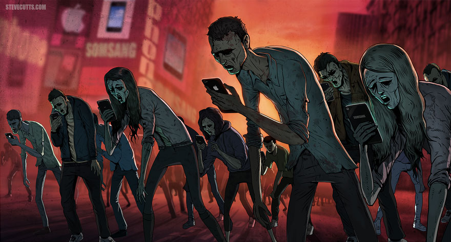
Handphone users
one of my most favourite artwork of his is the picture above , i like how he sees the hand phone addicts as mindless zombies (ehehe) and i realllllyy like his surreal artwork that is somewhat the same about real life ,but in a different prespective
Consumerism
He says that Consumerism shouldn’t hold a vice-like grip on our lives. And social media, well, we need to throw-off the shackles we so eagerly put on ourselves. Wouldn’t life be better then????/
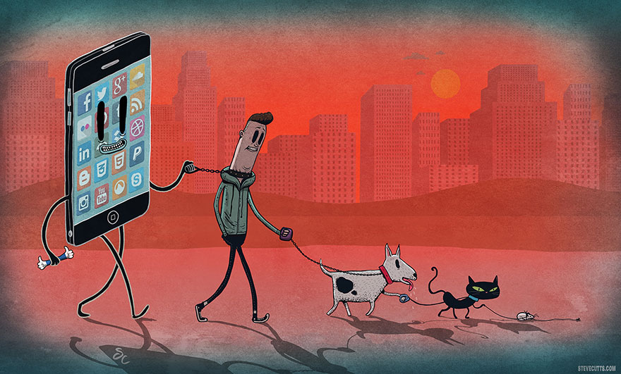
Handphone users
loooook how he animated the ironic-ness of humans thinking that we are the ones who control our phones when the truth is that our generation is so engrossed to our electronics that it is already reached to the point where we are being cant stop over using it that instead , the electronics are the one which are controlling us .
Consumerism
one of the reasons i like him is because his artworks looks quite plain and there are not as much of a wow factor but there is a deeper meaning to it . His works are also very fascinating, thought-provoking and usually lends an important message. His messages range from
gooooooooo check out atleast one of his videos because it really makes you see the real world and not everything is about hapiness and happy endings
Steve Cutts's art and films are mixed in humour and sometimes a more serious spin of man’s interaction with our environment and how it impacts the world we live in. and that is why i like him , there are no bull in his frank artworks . th e end :)
Hybrids-Extremely talented street artist and painter Hiroyasu Tsuri, aka TWOONE, was born in Yokohama in 1985. He developed an interest in drawing and crafting at an early age through skateboard graphics and graffiti. In 2004 he moved to Melbourne, Australia where he joined underground street art scene, quickly gaining prominence as one of Australia’s finest street artists. After graduating from Visual Arts New Media at Swinburne University, Melbourne in 2006, TWOONE started exhibiting his paintings in galleries across the world, but mural painting remained a big part of his prolific output, and he continues leaving captivating public artworks in every city he visits. He is widely known for his magnetizing depictions of hybrid, animal headed and human bodied creatures. In 2013 TWOONE left Australia for Europe, and currently resides in Berlin, Germany, I love how he uses graffiti and skateboard graphics to represent his interest in art at his early age. This picture shows how he made use for artwork as shown above.
Yuta Onoda, originally from Japan, is an illustrator / painter based in Toronto, Canada. He has been shaping his art aesthetic through various forms of media, finding new avenues to express himself.
wrath
trasition
the tiger mom
change champions
revelation
El capitan
king of spades
confusion
all is mine
happiness of being loved
the mask she wears
domination
I like the fusion of the new and the old . Modern and traditional kind of art. Most of the works talk about our constantly upgrading and changing world. I think that the meanings behind the works are very relatable to me and i like the play of colours as well as the use of traditional Japanese art style.
Art Wolfe is an American photographer and conservationist, best known for color images of wildlife, landscapes and native cultures. His artworks are a mixture of photograph and patterns. He made a series of artworks called Human Canvas. He normally take pictures of the wild, but in this album he blends photographs and pattern. I really like his works because he uses his strength, which is photography, and he turns the images into patterned like pictures. His works are really unique and original. For this album, he particularly choose the natives because he was inspired to do native like patterns.
This artist's real name is Georges Prosper Remi but known as Hergé. He is the creator of the cartoon comic Adventures of Tintin. In his artworks, there is a unique touch to his character's characteristics. From the face of the characters, we will immediately know who is the 'good' or 'bad' guy. He do not just draw the characters, he also writes the comic strips. I really like Hergé because of his unique drawing style. Even though his drawings look more like sketches, it is really nice.
This is his drawing of Tintin and his dog, snowy. From this drawing, i can read Tintin's character.
Charlotte Smith is a freelance graphic designer who does illustrations ( ofc ), graphic design and typography. The reason to why I like her works is because they are simple, able to portray what she wants ( no unnecessary mess such as random sketch lines ) and so pastel :D
Paper Food: ( coz food. )
Pudding (nomnom)
Cake (yumyum)
Ice cream pop ( so hungry )
Tea ( so British )
More works:
Web- https://www.behance.net/scharlotteoreilly
Zutto is a Russian-based digital illustrator,artist and character designer, with a very unique style. It was because of her unique style that caught my eye and the reason to why I like her works. Her illustrations are cute, dreamy and full of vibrant colours and fantasy characters that are very eye-catching which can attract many people to her works.
Saul Bass is a lengendary graphic designer who revolutionise corporate logos, title sequences and movie posters with his unique sense of aesthetics. Saul Bass designed one of the many famous logos in the US consumer market, such as the AT&T logos and the United Airline logo.
He also came up with a unique sense of aesthetic balance with his bold fonts, which later was mimicked by many graphic designers worldwide over time, crazy forms of deformed graphics as well as bold colours. Saul was not afraid to break the graphic design mold at that time, and his works brought in the minimalist sense to the graphic design platform to the US.
He was also well-known for his unique and quirky movie title sequences as well.
All in all, I regard Saul Bass as a godfather of the 1960s American graphic design. His daring move of breaking up the mold and later forming a unique style is something present artists and designers can learn from. I really like his sense of balance with bold colours as well as the distorted forms pieced together in a rather minimalistic manner. The oxymoron of minimal and big/bold worked really well together to form a refreshing aesthetics.